
The use of color should be a major consideration and a fundamental element of the overall design of an office, though is generally underutilized in workplace design. When you look at many office environments they are conspicuously lacking any colors other than neutral carpets, walls, and furniture.
The goal for use of color in the office is to try and effectively create conducive environments that encourage creativity, productivity, and stimulation, while also keeping employees happy and comfortable.
Color is the most powerful stimulant for one of our most sensitive senses, our eyes. The way we see color is directly correlated to our thoughts.
Imagine the walls of your office being the reason for your bad productivity or lower creativity!

Color Association
Color resonates with people in different ways. There is a reason why people prefer certain colors over others. Many cultures associate the same words and feelings with colors. Here are some examples of color associations:

Colors Promote Productivity
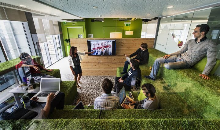
Be Inspired!
Take a moment and look up from your monitor. Take note of the space you’re in, and consider the effect that the most dominant color you see is having on you. Does that color energize you? Does it soothe you? Does it cause negative feelings? Visualize having your office workspace, conference rooms, and collaborative zones complete with colors that will create a positive and productive emotional state.
Researchers have been identifying how certain colors provoke psychological and physiological responses in people. Certain colors can make you feel anxious, irritated, or even make you feel sick, while other colors can evoke creativity, energy, and joy.
The colors that surround us during our hours spent at work affect us, our performance, and our moods. Deciding what color scheme to use when designing the interior of a workspace can be equally as important as hiring the right employees.
Color and Visual Comfort
Visual Comfort exists when the perceptual faculties in the human brain can operate without interference. Factors that inhibit perception in a workplace setting include light, glare, poor color selection, and inappropriate interior design.
Warm colors, such as red, orange, and yellow are associated with active emotional states. These colors are supposed to be more stimulating and make people feel happy and excited. Cool colors, such as blue, green, and purple are associated with restful emotional states. These create calm feelings.
Color Can Influence Performance
Red is a color that stimulates; increasing brainwave activities and heart rates. When overused, red can be intense and alarming so it is best to use this color carefully – accent wall, furniture, trim, and fixtures.


ORANGE is a playful color that boosts creativity and symbolizes endurance. This color is best used when you need to stay driven for high-energy meetings or working throughout the night. Orange can look childish and unprofessional if used excessively and may be best if distributed in small amounts –furniture and accessories.


BLUE is universally known as being an excellent color for productivity. Experiments have shown that people are more agreeable, relaxed, and quiet in areas painted in blues. Blue can be cold and depressing if used excessively or too deep in color
– Accent wall, furniture, accessories. A low saturated blue would be best for the walls of an office


GREEN has a refreshing, and natural association. It has been proved to boost creative thinking. Green is good for people working long hours since it does not cause eye fatigue. A lighter shade of green on


Yellow is a color that stimulates and energizes; it induces a sense of optimism. Yellow is the brightest color and can cause eye fatigue after extended exposure, but can revitalize a room with touches of color – accents, furniture, fixtures, and office accessories.


Neutral colors such as brown, white, cream, and grey colors can help tone down the mind, but mixing with brighter and vivid colors can create a refreshing and harmonizing atmosphere. White creates a sense of spaciousness and can promote creativity, especially when paired with natural light. White is great for large and small rooms and, any accent color can be thrown in to create liveliness. Brown walls can create a warm feeling but can make a room seem dark, which will de-energize employees. Black and dark grey are good accent colors and will add depth to a room. A recent study has found that bland gray, beige and white offices induce feelings of sadness and depression, especially in women.


Accent Colors

Designers recommend following the 60-30-10 Rule when decorating a space.
Why does this work?
Three is a good rule for formulating your color palette. More than three colors can make rooms feel too busy and off balance. The 60% should be the dominant color which unifies the theme, the 30% is the secondary (main accent) color which creates visual interest, and the 10% is the secondary accent color which provides a little spark of energy to the environment.

Translated to workspaces and collaborative zones:
– 60% of the room’s color will include the walls and floors
– 30% of the room’s color will include the furniture or one accent wall
– 10% of the room’s color will include trim and molding, furniture and accessories
Value and Saturation
Not only the color, but the value of the shade and the saturation must also be taken into consideration. High saturation colors are more interesting.
Greens and Blues: these are the ideal colors for creativity, innovation, brainstorming, and keeping the mood calm without putting people to sleep.

Studies show that as much as 60% of your feelings about a product, or a place such as a lobby or a conference room will be influenced by the colors you experience.
A University of Texas study found that bland gray, beige, and white offices induced sadness and depression in women, while men get these feelings from purple and orange.

Not only the color but the value (lightness, darkness) of the shade and the saturation (dullness, brightness) must also be taken into consideration.
• High saturation colors are more stimulating
• Paint Texture matters – glossy paint elicits higher energy
• Accent colors create balance and define your space
• Accents help energize the environment
• Brighter colors are used as accents to add interest to space
• Too much of one color can leave us feeling off balance

COLORS AND EMOTION
– RED – Affects body energy, alertness, danger, increased attention to detail
– BLUE – Affects the mind-calming, happy, stable
– YELLOW – Affects self-confidence creativity, fresh, optimistic
– GREEN – Affects balance of mind, body, and emotion efficiency, working long hours

